Chances are that at least once in your life, you’ve looked at the bottom of a check and wondered, “What are those strange, alien-looking numbers? And why are they printed that way, with all the weird bulges?”
It’s pretty common knowledge (in the industry, at least) that those are the routing number – in other words, the name of the bank – and the account number that the check is written against. But what about the font itself? What’s the reason for that odd mechanical typeface, and why is it used on every check you’ve ever seen?

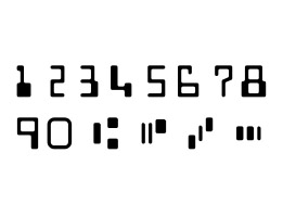
The font is called E13B, and it’s been the standard for all checks in North America since the late 1950s. As for the bulges, they’re so that the numbers have a certain magnetic signal strength at each point from left to right.
Confusing? Think of it this way: Rather than recognizing each number as a whole character, the way humans do, a magnetic reader picks up a single “slice” of the character at a time and measures its signal strength. (These slices are 0.013” wide, the reason for the “13” in E13B).
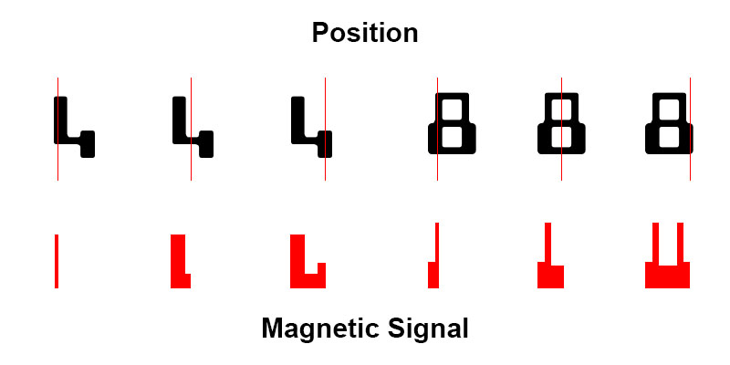
As you can see above, since the magnetic reader is measuring signal strength in a straight line – not capturing pixels like an ordinary camera – it’s not important where the magnetic ink is; what matters is how much ink there is in a vertical line at any given point. (Note: This is a bit of an oversimplification, as the reader is also measuring the change in magnetic signal strength, producing a wave pattern with both positive and negative “peaks.” But for all intents and purposes, the process is the same.)
At any rate, the bulges and other odd printing features are there to give a distinct magnetic shape to each character – strange visual appearance or not. That means having crisp edges, and as few curves or slants as possible, so that each “linear moment” is well-defined. Furthermore, every E13B character is designed to have at least two positive and two negative “peaks” in magnetic signal strength to help delineate one from the next.
Of course, since MICR was adopted nearly 70 years ago, the characters also had to be designed to be mostly recognizable by humans, because manual intervention was much more frequent back then. Modern check scanners capture both the magnetic MICR signal and a visual image of each check, applying Optical Character Recognition (OCR) to the latter. When the scanner picks up a questionable MICR character, it will cross-reference that character with the OCR version and either confirm it, or reject it and kick it out for manual inspection. Between these two methods, well over 99 percent of checks are read correctly without any manual intervention.
Back in the 1940s and 50s, there were no scanners that captured images of checks – to say nothing of software that performed OCR. So any time the MICR signal wasn’t perfect, the check had to be pulled out and inspected by a person before continuing. Up to 5 percent of documents back then required manual sorting. So, bottom line, the numbers still had to be readable to the human eye.
Of course, the E13B font wasn’t perfect: Even though it was designed to have well-defined peaks and edges, it was still possible to get misreads if, for example, the signal strength was off due to inconsistent printing, or the alignment wasn’t quite right. So another font, called CMC7, was developed to make the reading even easier for machines:
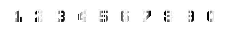
As you can see, each character of CMC7 is actually a bar code. That makes reading each “linear moment” of magnetic ink an all-or-nothing proposition: Either there is a signal, or there isn’t. You don’t have to interpret how strong the signal is or how it fits into a character’s shape.
Each CMC7 character contains seven vertical lines (hence the “7” in the name), separated by four small gaps, as well as two large gaps that appear in different places for each. This results in seven positive and seven negative peaks in signal, along with a character-specific marker from the two big gaps.
This makes machine-reading much more accurate in theory – but the CMC7 font came with its own set of challenges, which we cover in the next article in this series. In most places where E13B was already in widespread use, there was little desire to uproot the existing systems and replace them. That’s why today, you’ll find both E13B and CMC7 in use in various places around the world – two odd-looking solutions to the same problem.